1. CIELAB color space evaluation - Lightness
The client engaged with a branding agency who provided a colour palette, but it wasn’t designed for digital use and lacked the range and depth needed to support a scalable digital real-estate that would support multiple products.
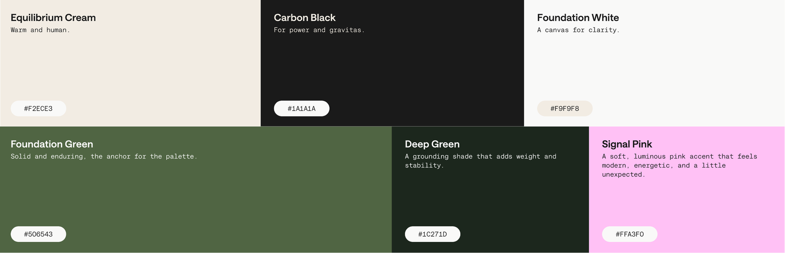
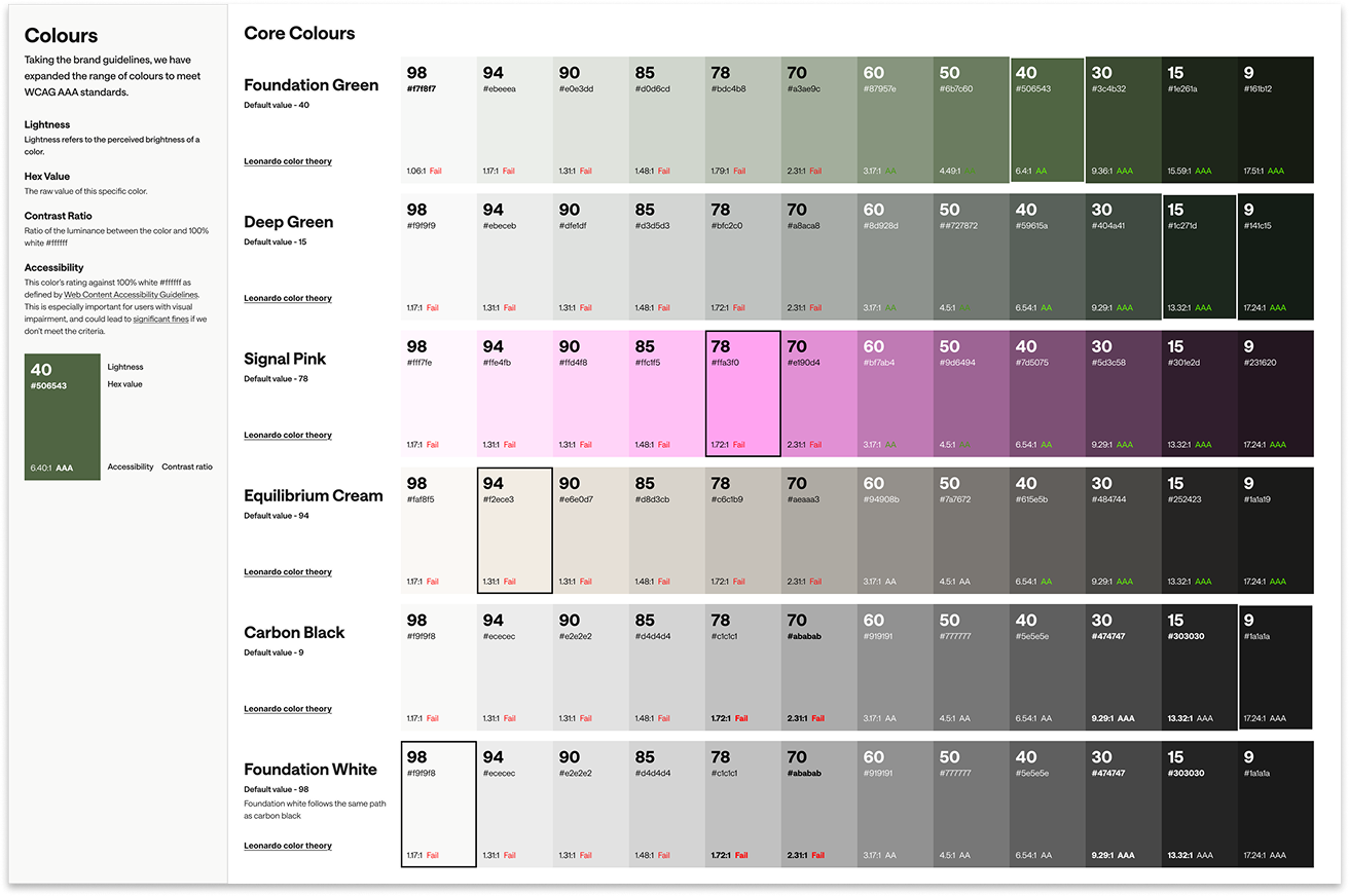
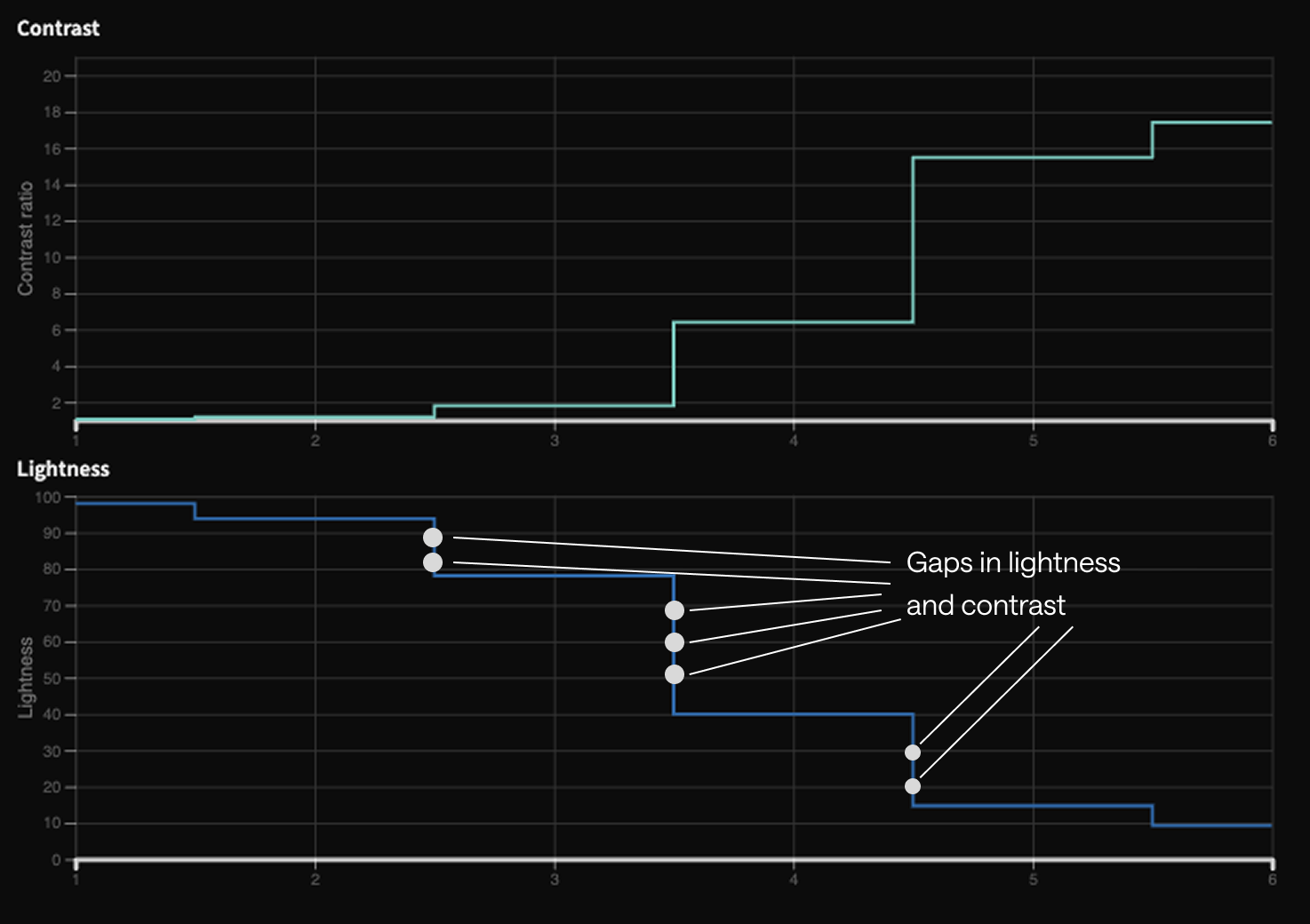
I started by taking the existing colours, stripping back the hue and saturation to analyse their lightness and contrast values. The overall range and separation were strong, but inconsistent in places. I then mapped out these values and introduced additional lightness steps where needed, creating a more consistent progression and improving contrast distribution across the scale.
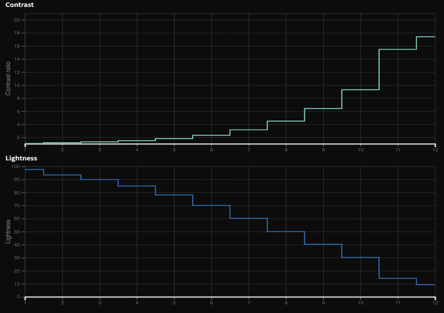
Below is the progression after introducing additional intervals. This expands the available lightness range across the client’s interface and establishes a clearer and more consistent foundation for how contrast ratios are applied and interpreted.
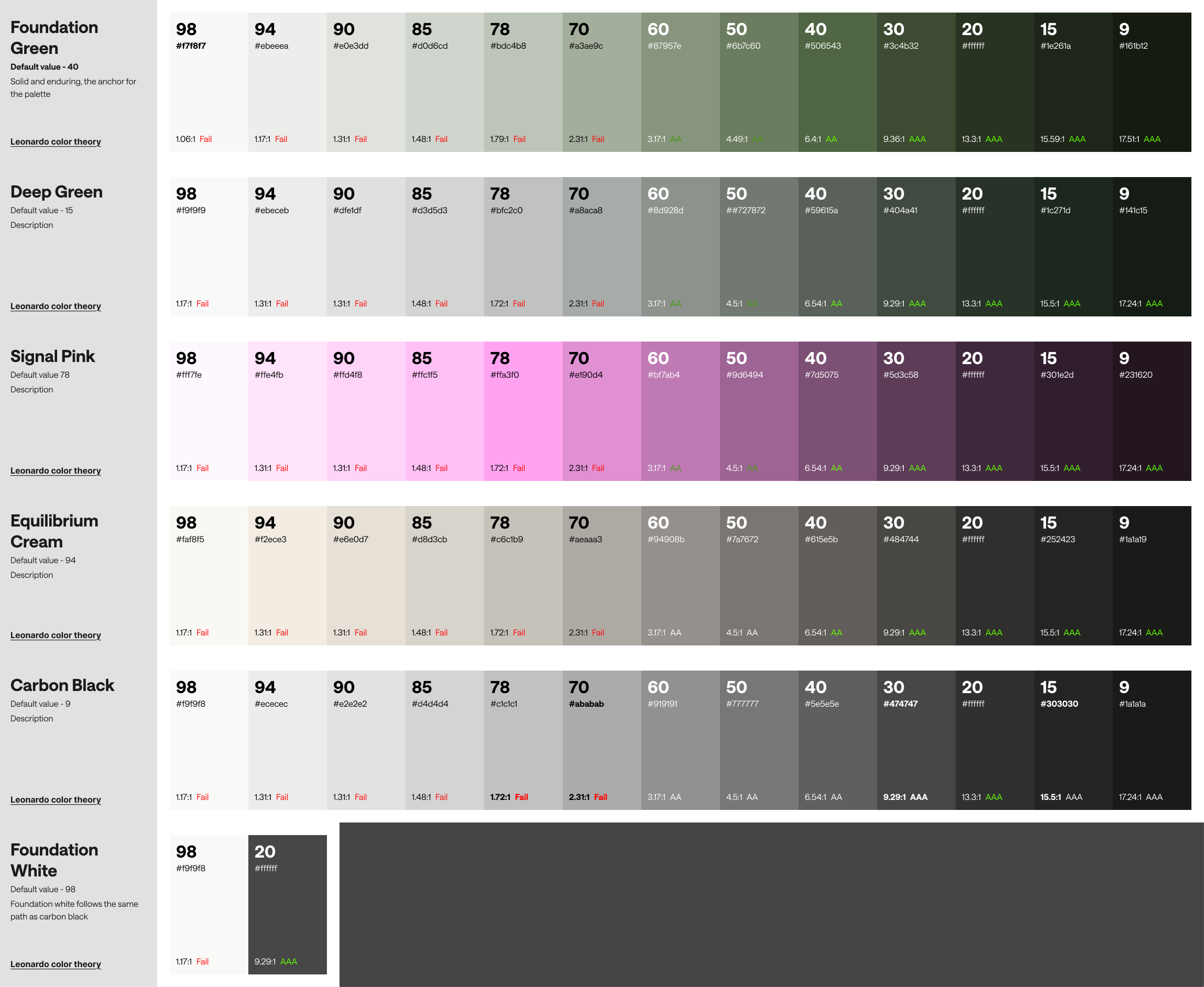
Next, I derived lightness-calibrated tonal stops for each color, standardising contrast ratios across the palette. This ensures perceptual consistency and predictable accessibility performance for all swatches under W3C criteria. You can also see the corresponding contrast ratio which will help determine the accessibility score.
2. CIELAB color space evaluation - Hue and saturation
A quick review shows that the range of hue and saturation is very narrow with the color palette provided.
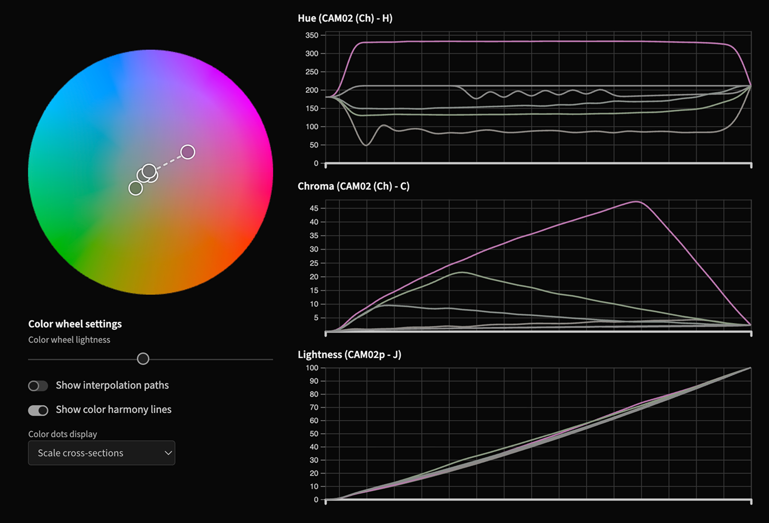
If we examine the palette in a 3D hue and saturation space, it becomes clear that it doesn’t fully utilise the available spectrum. This results in a narrower colour range and limits the overall vibrancy and expressiveness of the product.
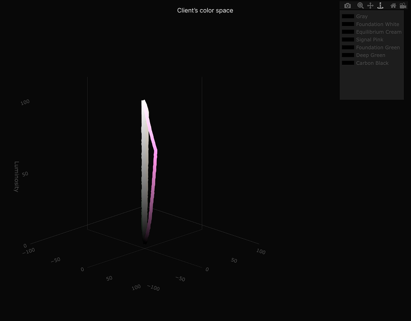
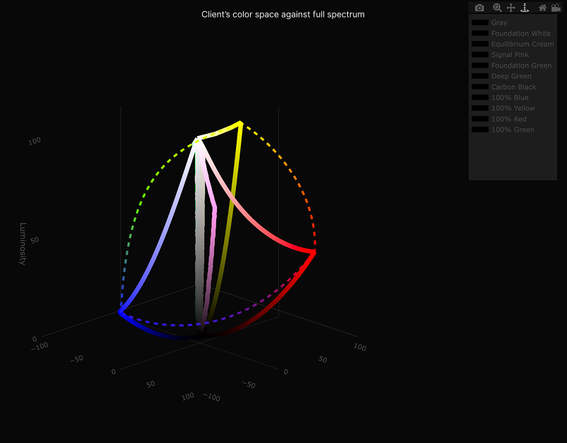
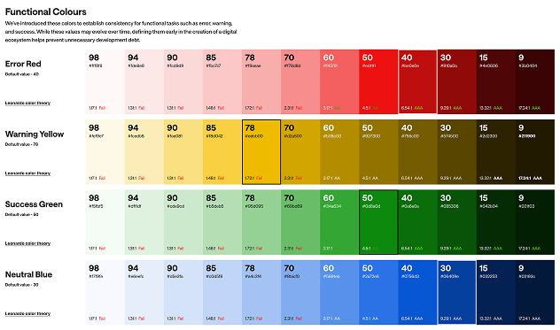
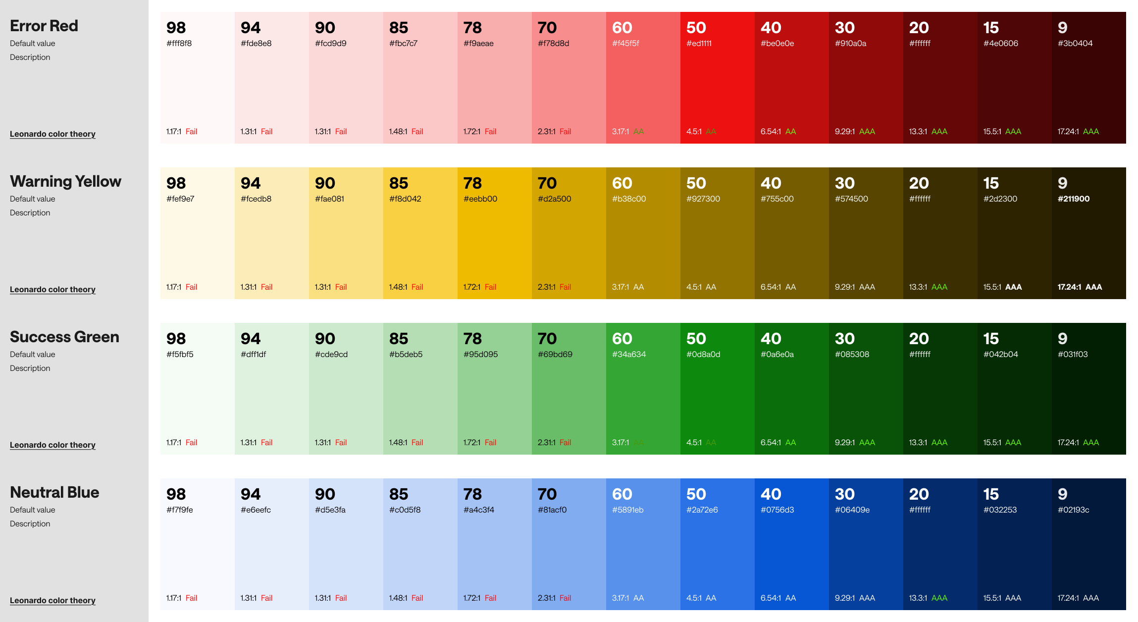
This was raised with the client, but the decision was made to retain the existing colour palette. As a workaround, I introduced a set of RGB colours for functional use, covering states such as error, warning, success, and neutral.
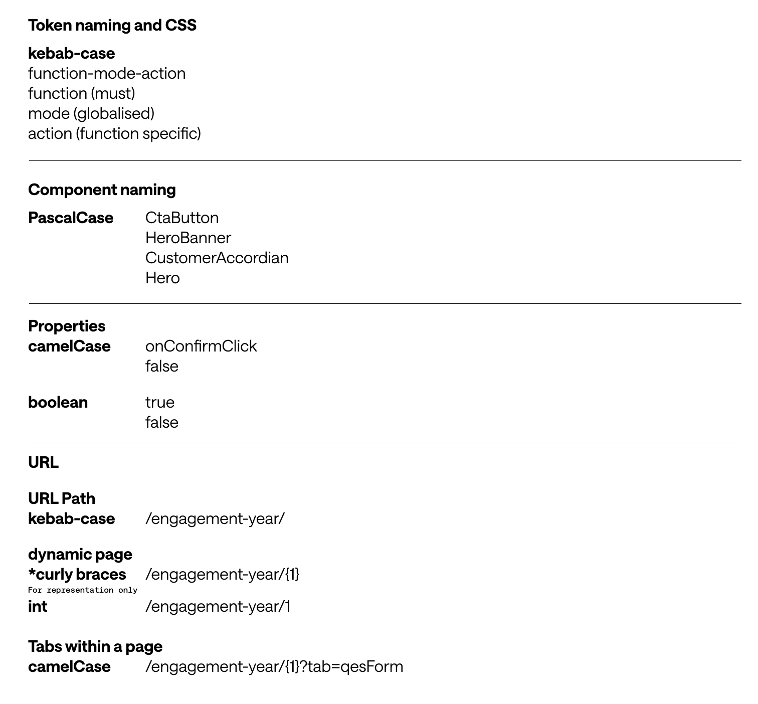
3. Naming methodology
Before diving into tokens, I collaborated with the front-end lead to define a clear naming convention. This ensures consistency across the codebase and design output. It also makes it easier to identify and understand elements, even when they’re viewed in isolation.
4. Design system structure
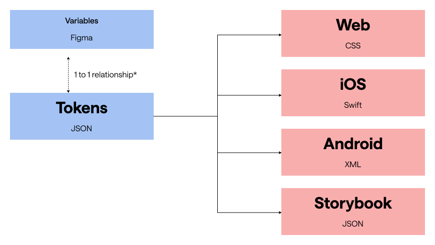
One of the most common issues I’ve encountered with design systems is the attempt to force a 1 to 1 relationship where it doesn’t naturally exist. JSON file and Figma don’t align perfectly in how variables are structured or applied. In JSON, you can bundle things like colours and typography into a single token, whereas in Figma they’re applied independently.
Instead of forcing alignment, it’s more effective to match structures where it makes sense, and deliberately handle the differences in a way that works for both designers and developers. This creates a system that feels coherent without becoming rigid or impractical.
5. Design tokens
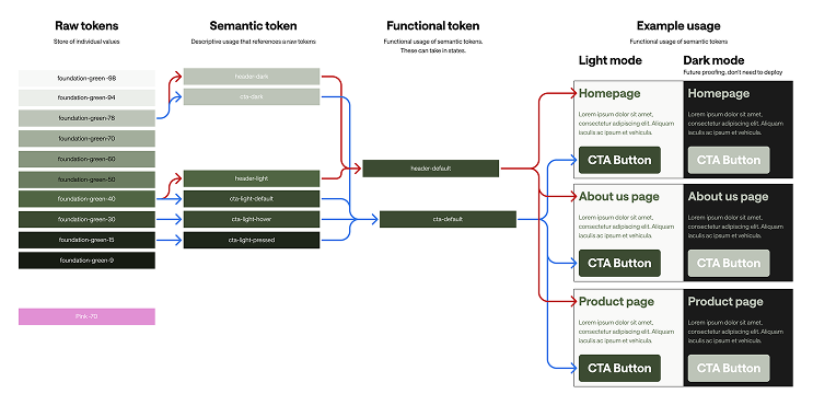
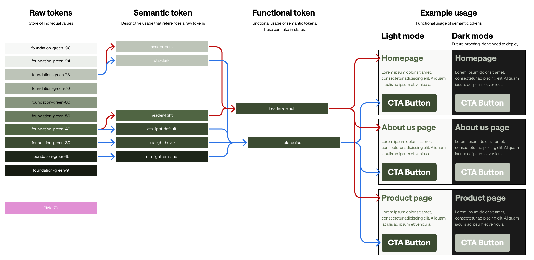
Once the colours, naming convention, and overall structure were defined, I moved on to building the design tokens. Rather than following the typical model established by Adobe [Global → Alias → Component-specific] model, I restructured this into [Raw → Semantic → Functional] for JSON, and [Raw → Semantic → Device/Mode] for Figma, This better reflects how tokens are actually used in each environment..
The distinction between JSON and Figma is intentional. It accounts for the fundamental difference between how code consumes styles and how they are defined and applied within Figma, allowing both systems to stay aligned without forcing a structure that doesn’t fit.
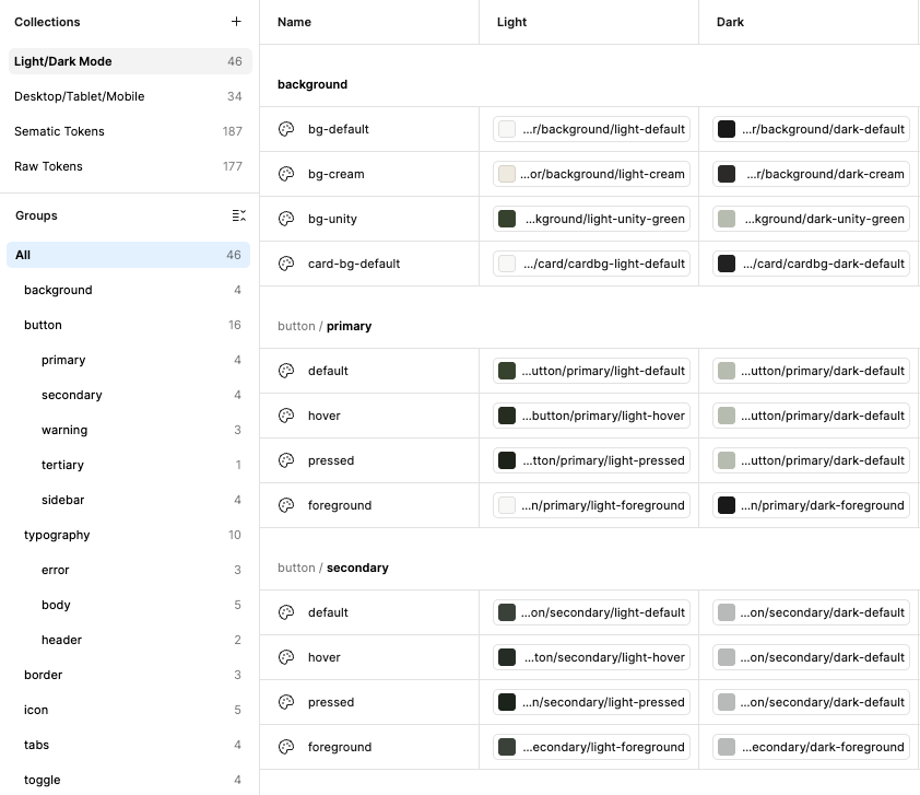
Here’s a breakdown of the variable structure in Figma.
6. Component design
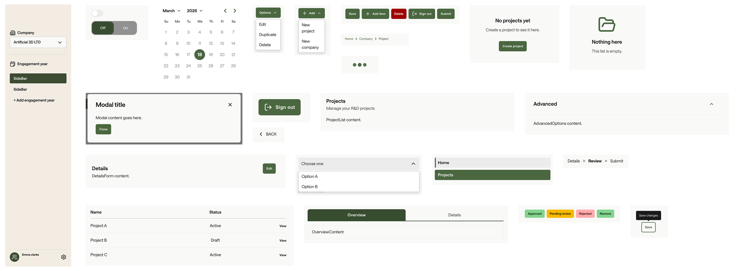
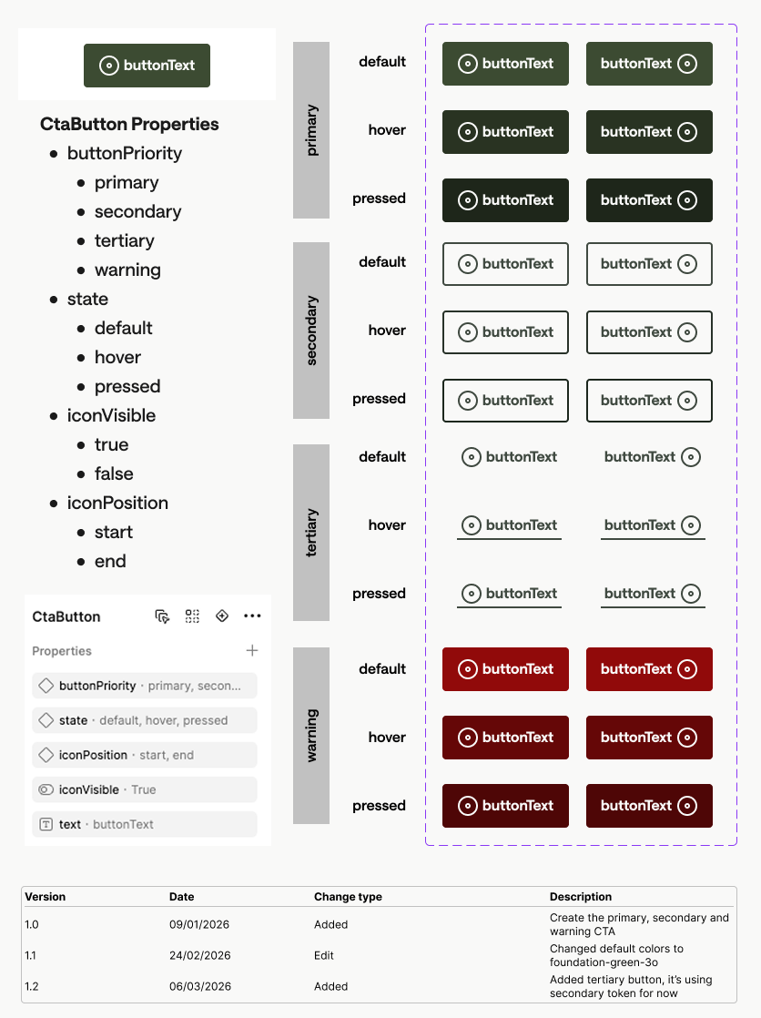
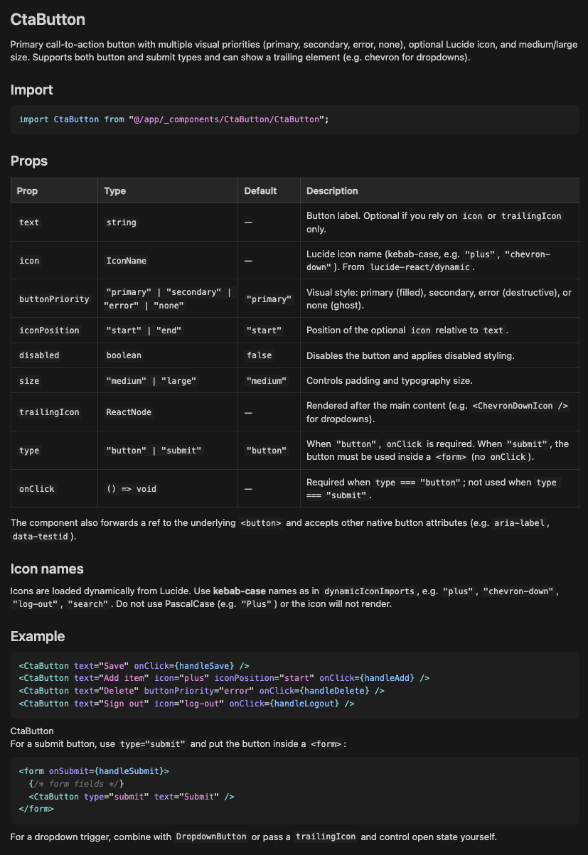
Next, we progressed into component development. I documented each component and partnered with the FE lead to define how design properties translate into code. Some properties are listed in Figma but not in code. For instance, In Figma, state is represented explicitly to support visibility and design exploration. In code, however, many states such as hover and active are handled natively through CSS and browser behaviour. As a result, only meaningful, controllable variables are exposed as props, keeping the component API clean and maintainable.
We went on to develop a full library of components. The designs were connected to Claude via Figma MCP to facilitate “vibe” prototyping for the non-technial team so they can test out concepts and visualise their ideas. However, all delivery work remained in Figma and implemented by FE, as AI and MCP are not yet reliable at producing production ready code. Additionally, we were intentional about not outsourcing design thinking to AI, as this can lead to a lack of understanding of the problem space, ultimately creating more design and development debt over time.