Project overview
Created the Arc design system to drive alignment and scalability across a large ecosystem of products. Built a token-driven foundation to support theming, white-labelling, accessibility, and a unified, reusable component library.
I led the development of design tokens, component architecture, documentation, and contribution workflows. Partnered closely with design, engineering, and content teams to ensure consistency across disciplines. Delivered accessible, production-ready components with parity between Figma and Storybook.
Storybook: https://ui.digital-ent-int.bt.com/latest/docs/intro
Establish why it was under-designed and under-utilised
BT invested over £3 million across two years to develop a design system with an external agency. However, adoption remained extremely low, with fewer than 100 daily inserts. To address this, we began with user research to understand the core challenges faced by designers and developers.
Key pain points
i. Unusable Figma components - The initial Figma library was created by the external development team with little to no collaboration with designers or engineers. As Figma evolved, the components were not updated to reflect new capabilities, resulting in a system that felt outdated and not fit for purpose.
ii. Lack of use cases and structure - The system was built without proper discovery or design input, meaning real product use cases were not considered. For example, the primary CTA was limited to a single indigo fill, making it unusable in common scenarios where indigo backgrounds were already present in brand-led content.
iii. guidance or documentation - The Figma library lacked any meaningful structure or guidance. Components were presented as a flat collection with no explanation of purpose, usage, or best practices, leaving teams without the clarity needed to adopt the system effectively.
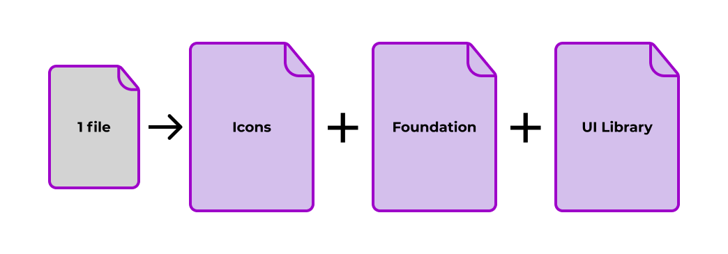
1. File structure
To address the structural and adoption issues, we redefined the design system architecture by splitting the monolithic Figma file into three purpose-driven libraries. This improved performance, clarity, and scalability, while creating a more maintainable system for both design and engineering.
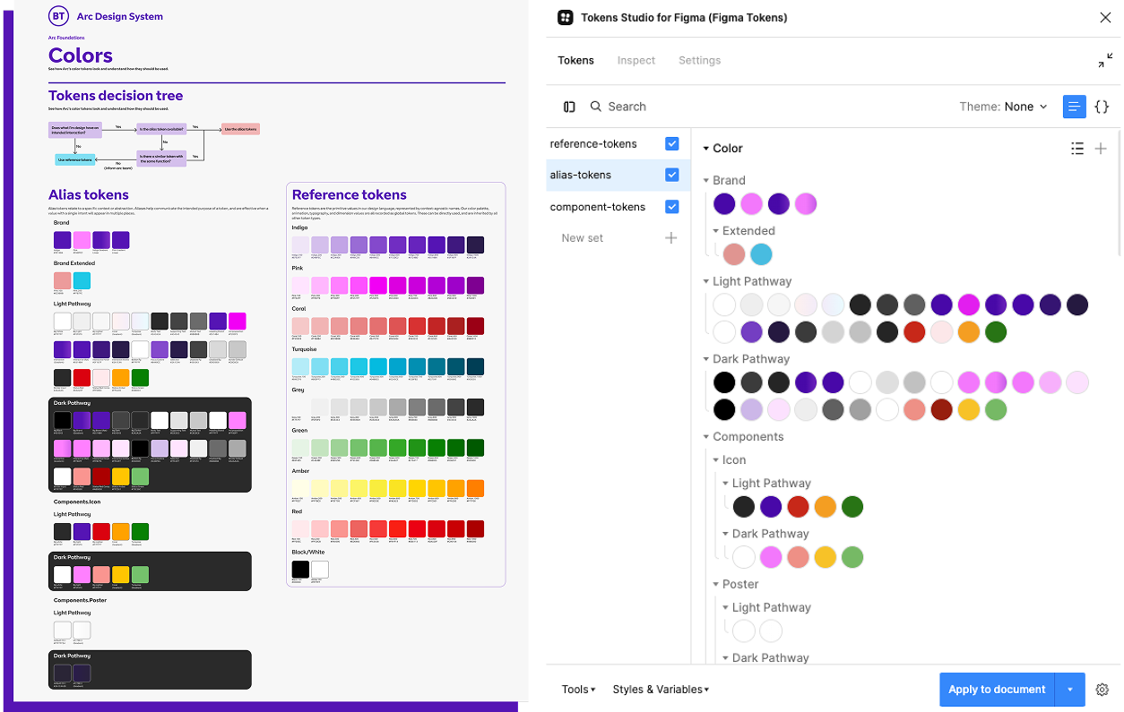
Foundations - A centralised file containing all core styles, including colour, typography, layout grids, and effects. This acts as a single source of truth for all designers, regardless of whether they are directly using the design system. While Arc is built in React, other BT products use LWC, Flutter, and Swift, so the foundations layer enables consistency in colour and typography across platforms, even where components are not yet standardised.
Icons - Icons were separated into their own library, as they are treated as components in Figma and were skewing usage metrics. Isolating them provides a clearer and more accurate view of component adoption and usage across the system.
UI Library - The UI Library contains all components aligned 1 to 1 with the React implementation. This ensures a tight relationship between design and code, supporting consistency, scalability, and easier handoff between teams.
2. Create a 1-to1 relationship for design tokens
Next, we had to establish a 1 to 1 relationship between design tokens in GitHub and the Figma Foundations file. As there were already existing tokens in use across products, creating a new repository was not a viable option. Instead, we defined a structured approach to map the tokens across both environments without disrupting existing implementations. This was the logic flow behind the solution we developed. Below is the original note and a tidied version of the implmentation.
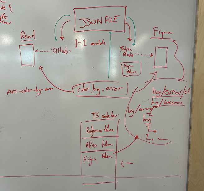
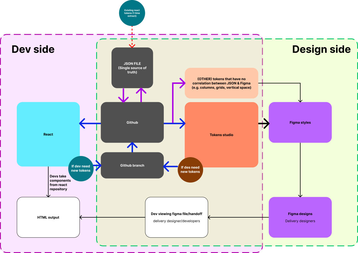
Next, I collaborated with the development team to integrate the JSON token file into Token Studio and Figma (this was before Figma had introduced variables), ensuring consistency between code and design. With this foundation in place, we moved on to building usable, production-ready components.
3. Component research and creation
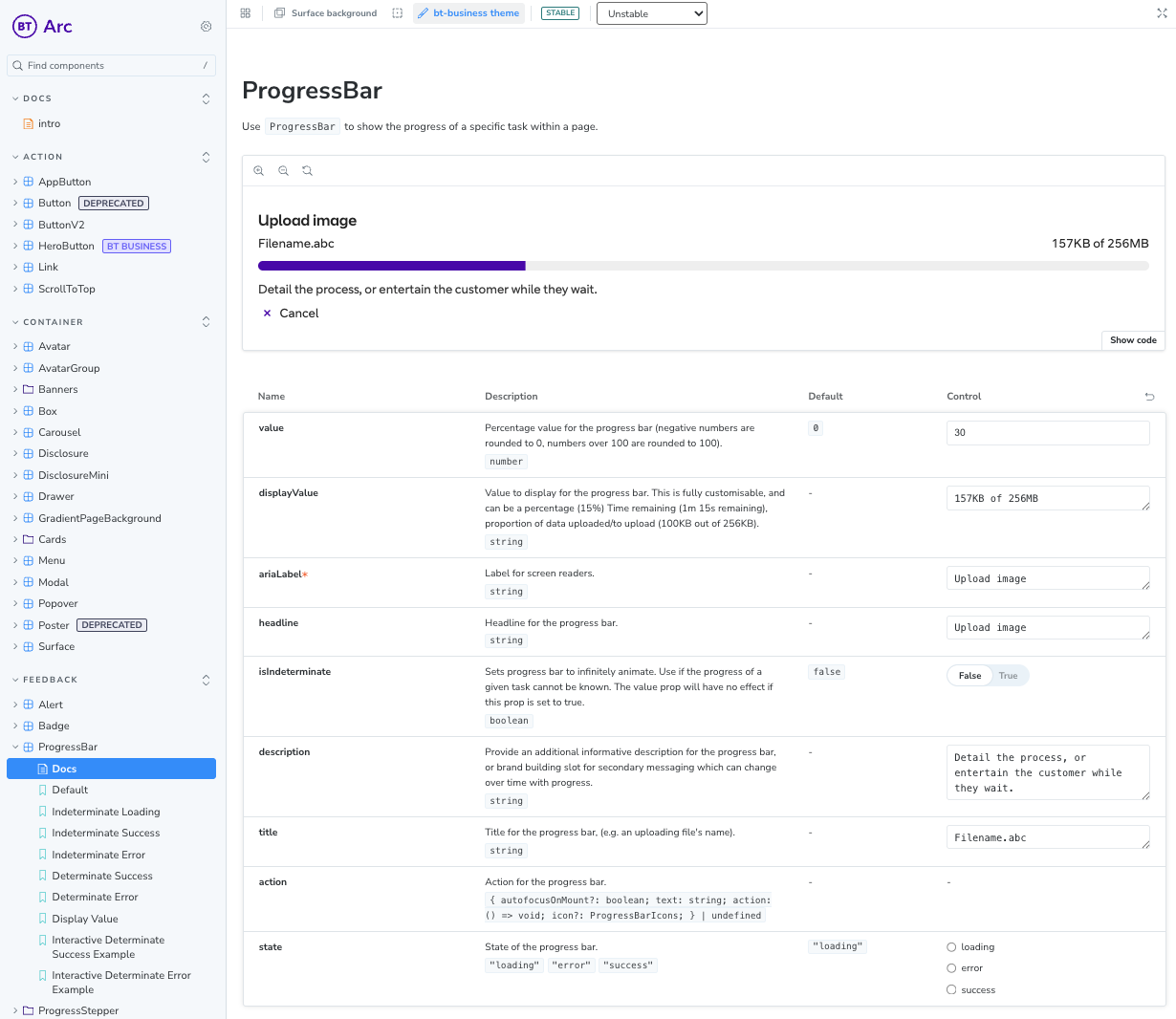
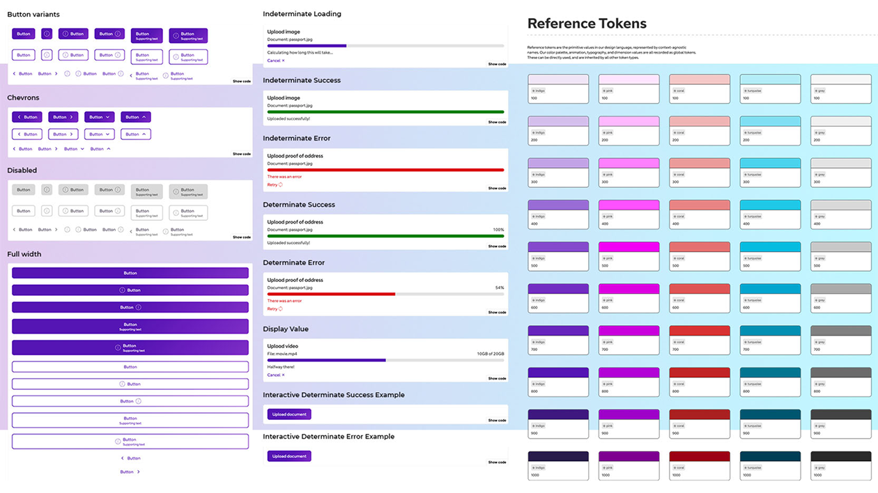
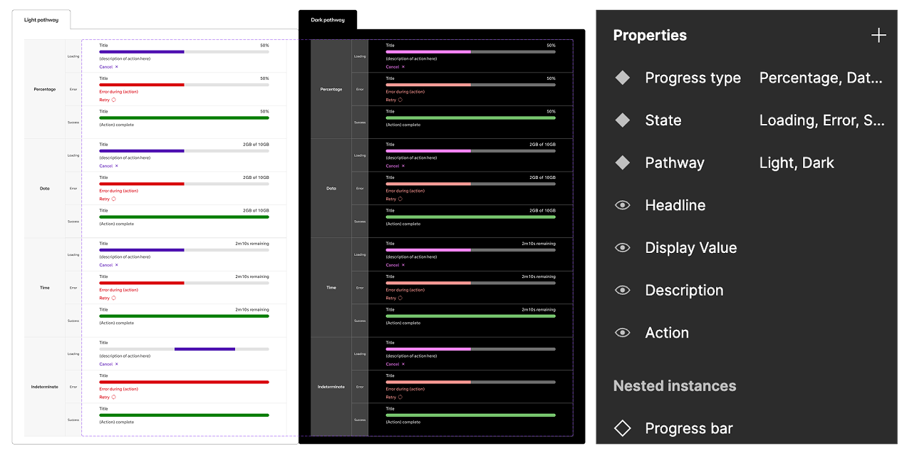
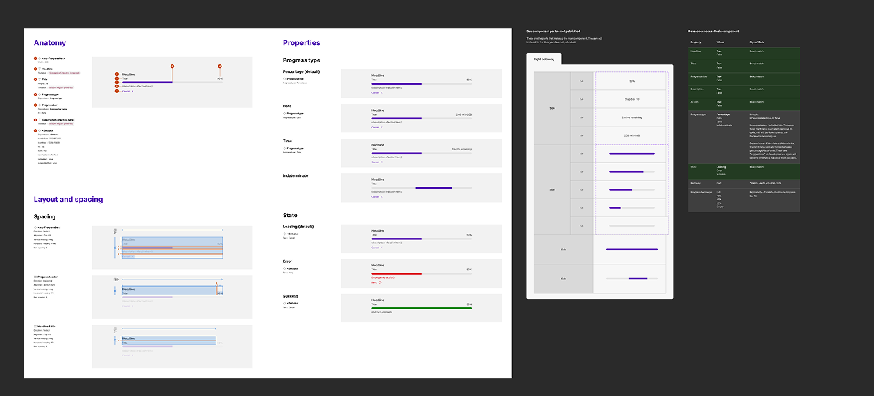
With the token foundation established, we transitioned into component-level research. This involved auditing existing work across the wider team, evaluating UX decision making, and benchmarking against industry patterns. For this case study, we will explore the progress stepper component
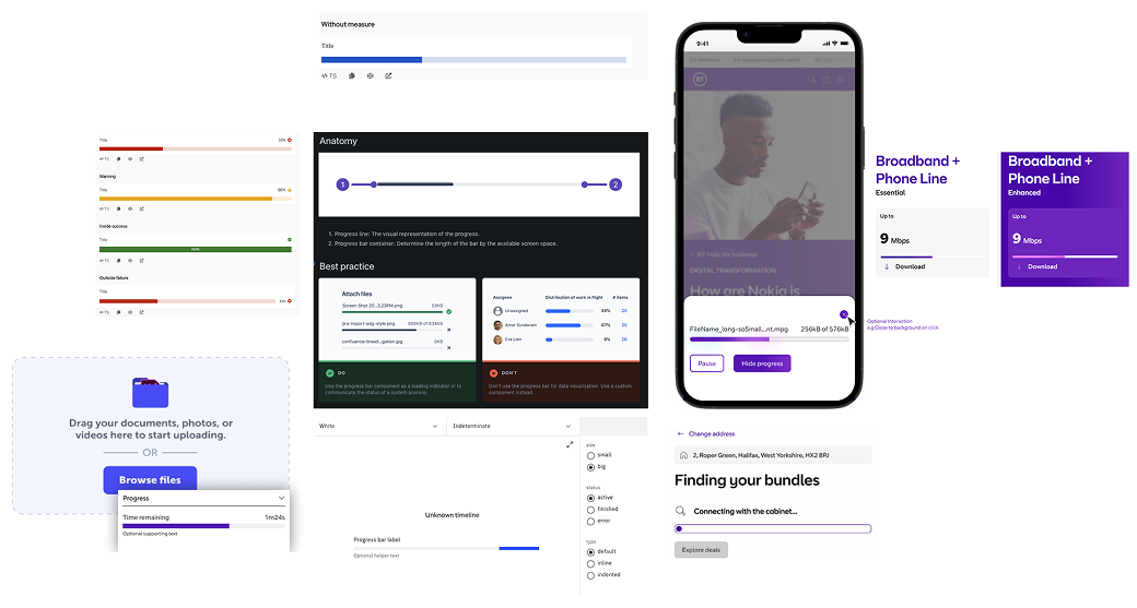
Next, we progressed into building components in Figma, collaborating with the development team to define handoff requirements and ensure alignment with implementation. This resulted in a comprehensive component set, accompanied by detailed developer notes on technical structure and behaviour.
With the tokens in place, we moved into the research phase for each component. We reviewed existing work from the wider team, analysed UX decision making, and benchmarked against patterns used across the market.
4. Documentation and testing
Final result
The final result is a fully comprehensive library with over 1000 component variations.
You can see the result of the design system in storybook.